Exploring Data#
Exploratory Data Analysis (EDA) is an approach to modeling data that produces insights into the characteristics of a dataset. EDA is useful for feature engineering as well as model selection and can save time and lead to better modes when included in your machine learning lifecycle. In general, there are two types of Exploratory Data Analysis - quantitative and graphical. Quantitative data analysis summarizes the data using statistical or probabilistic methods. Graphical analysis uses techniques such as scatterplots and histograms to glean information from the structure and shape of the data and can incorporate Manifold Learning to reduce the dimensionality of the samples.
Describe a Dataset#
The Dataset API has a handy method named describe() that computes statistics for each continuous feature of the dataset such as the column median, standard deviation, and skewness. In addition, it provides the probabilities of each category for categorical feature columns. In the example below, we'll echo the Report object returned by the describe() method to get a better understanding for how the values of our features are distributed.
$report = $dataset->describe();

echo $report;
[
    {
        "offset": 0,
        "type": "categorical",
        "num categories": 2,
        "probabilities": {
            "friendly": 0.6666666666666666,
            "loner": 0.3333333333333333
        }
    },
    {
        "offset": 1,
        "type": "continuous",
        "mean": 0.3333333333333333,
        "standard deviation": 3.129252661934191,
        "skewness": -0.4481030843690633,
        "kurtosis": -1.1330702741786107,
        "min": -5,
        "25%": -1.375,
        "median": 0.8,
        "75%": 2.825,
        "max": 4
    }
]
We can also save the report by passing a Persister to the saveTo() method on the Encoding object returned by calling toJSON() on the Report object.
use Rubix\ML\Persisters\Filesystem;

$report->toJSON()->saveTo(new Filesystem('report.json'));
Describe by Label#
You can also describe the dataset in terms of the classes each sample belongs to by calling the describeByLabel() method on a Labeled dataset object with categorical labels.
$report = $dataset->describeByLabel();
Visualization#
Another technique used in data analysis is plotting one or more of its dimensions in a chart such as a scatterplot or histogram. Visualizing the data gives us an understanding as to the shape of the data and can aid in discovering outliers or for choosing features to train our model with. Since the library works with common data formats, you are free to use your favorite 3rd party plotting software to visualize the data copied from Rubix ML. If you are looking for a place to start, the free Plotly online Chart Studio or a modern spreadsheet application should work well for most visualization tasks.
Exporting Data#
Before importing a dataset into your plotting software, you may need to export it in a format that can be recognized. For this, the library provides the Writable Extractor API to handle exporting dataset objects to various formats including CSV and NDJSON. For example, to export a dataset in CSV format pass the CSV extractor to the exportTo() method on the dataset object.
use Rubix\ML\Extractors\CSV;

$dataset->exportTo(new CSV('dataset.csv'));
Converting Formats#
You may want to convert a dataset stored in one format to another format. To convert formats, pass an extractor object to the export() method on a target extractor that implements the Writable interface. In the example below, we'll convert a data table from CSV format to NDJSON, saving it to a new file.
use Rubix\ML\Extractors\NDJSON;
use Rubix\ML\Extractors\CSV;

$extractor = new NDJSON('dataset.ndjson');

$extractor->export(new CSV('dataset.csv'));
1D Histogram#
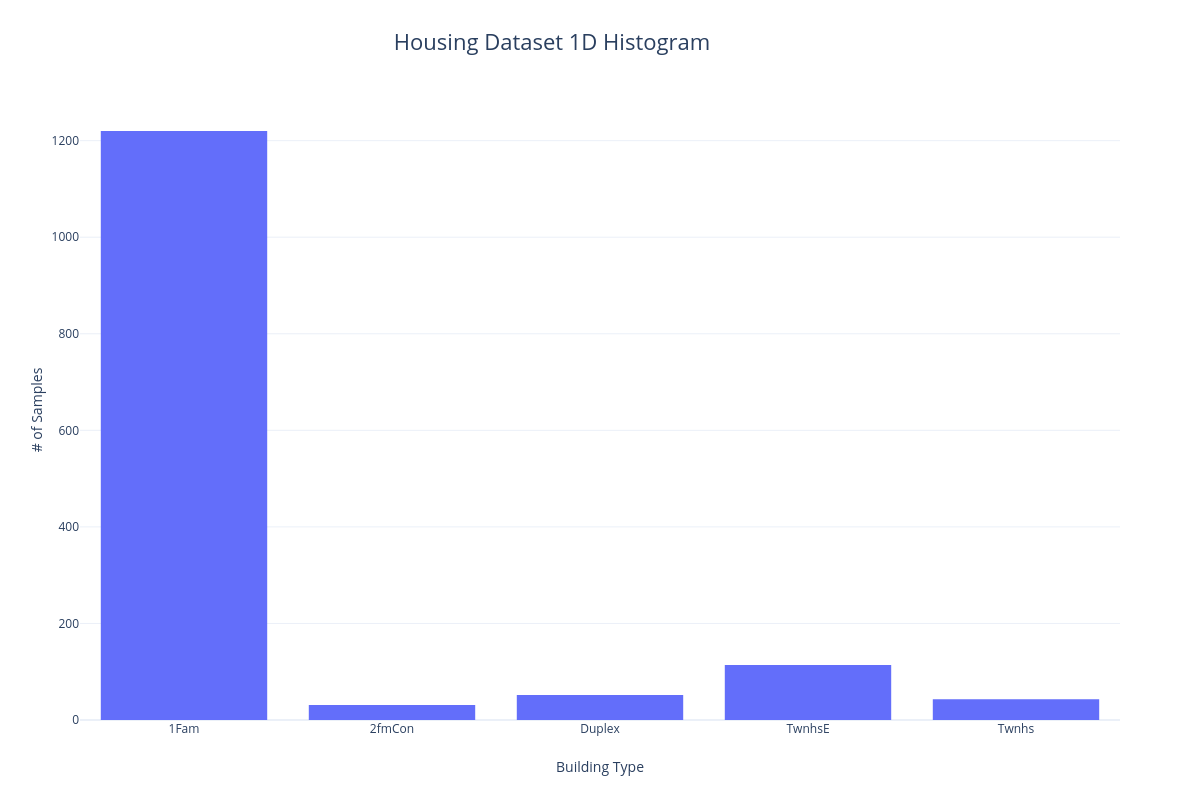
One way to visualize the categorical features of a dataset is to put each sample into a bin corresponding to the particular category it belongs to. We can then count the number of samples and display them in a histogram so they can be visually compared. In the following example, we'll bin the samples of the Housing dataset according to building type.
2D Scatterplot#
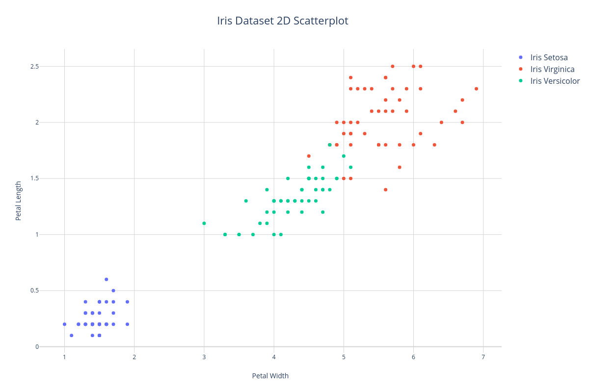
A common way to visualize the continuous features of a dataset is to plot two features as X and Y axis of a scatterplot. In the example below, we'll plot the petal width and petal length features of the Iris dataset. Notice that we can distinguish 3 clusters corresponding to each class label - therefore, these features will do a pretty good job of informing the learner at training time.
Manifold Learning#
Manifold Learning is a type of dimensionality reduction that aims to produce a faithful low-dimensional (1 - 3) representation of a whole dataset for visualization. Unlike the example above in which we isolated a fixed number of features, Manifold Learning allows us to plot a representation of all the features. This representation is referred to as an embedding because the high-dimensional features are embedded into a lower-dimensional manifold.
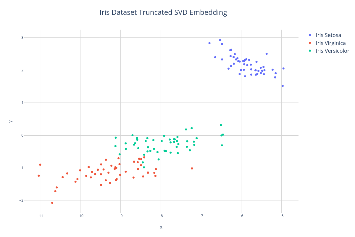
In the first example, we'll use a dimensionality reduction method called Truncated SVD to project the Iris dataset down into 2 dimensions and then export the data to a CSV file using the exportTo() method so we can import it into our plotting software.
use Rubix\ML\Transformers\TruncatedSVD;
use Rubix\ML\Extractors\CSV;

$dataset->apply(new TruncatedSVD(2))
    ->exportTo(new CSV('embedding.csv'));
When we visualize the embedding, again we see the formation of clusters, however, notice that the X and Y axis no longer correspond to individual features but rather to arbitrary axis of the 2-dimensional embedding of all the features.
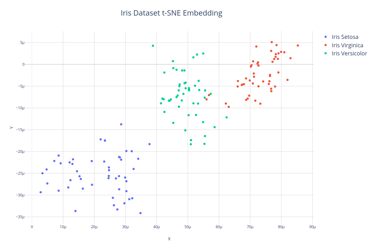
Another algorithm often used for manifold learning is T-distributed Stochastic Neighbor Embedding or t-SNE. Unlike Truncated SVD which is a linear dimensionality reducer, t-SNE is able to find non-linear manifolds of the dataset and therefore can sometimes produce more faithful representations of the data in low dimensions. In the example below, we'll use the t-SNE transformer to embed the 4-dimensional Iris dataset into 2 dimensions so we can visualize it.
use Rubix\ML\Transformers\TSNE;
use Rubix\ML\Extractors\CSV;

$dataset->apply(new TSNE(2, 100.0, 10.0))
    ->exportTo(new CSV('embedding.csv'));
Here is what a t-SNE embedding looks like when it is plotted. Notice that although the clusters are sparser and more gaussian-like, the structure and distances between samples is roughly preserved.